Hiya, everyone. This is my simple table code that is the base of pretty much every table I make. It's short and sweet and easy to adapt from picture-at-top to picture-at-bottom, you can add styling, etc. I'm using a bastardized version of a table Skylark made me to demonstrate.
div: a div is just a "division", a section of a piece of HTML code. Divs are flexible and actually very easy to use, and superior to <*table> tags for this purpose. Table tags are intended to be used only to display tabular data, and they cause websites to load slower, as each table needs to be rendered before it loads the next piece of data.
In this case, we only have one div. This div is the parent element, only, it has no children. If you need to add specific styling to another element (such as adding a quote), that div will become a child to the parent. If you want to add things like borders, border-radius, box-shadow, in most cases you want to add it to the parent element.
box-sizing: usually when you make a div, the width of it does not include padding and borders. This means that if you have a 500px wide div and add 25px padding on either side, you'll have a 550px wide div in reality, and it'll not look as you want it to. I use border-box because that puts the padding/border on the "inside" of the 500px, meaning my div is still 500px wide but it indents content from the sides. For borders, though, you might want to increase the base width of the div to account for them, otherwise the borders will actually cover part of the image.
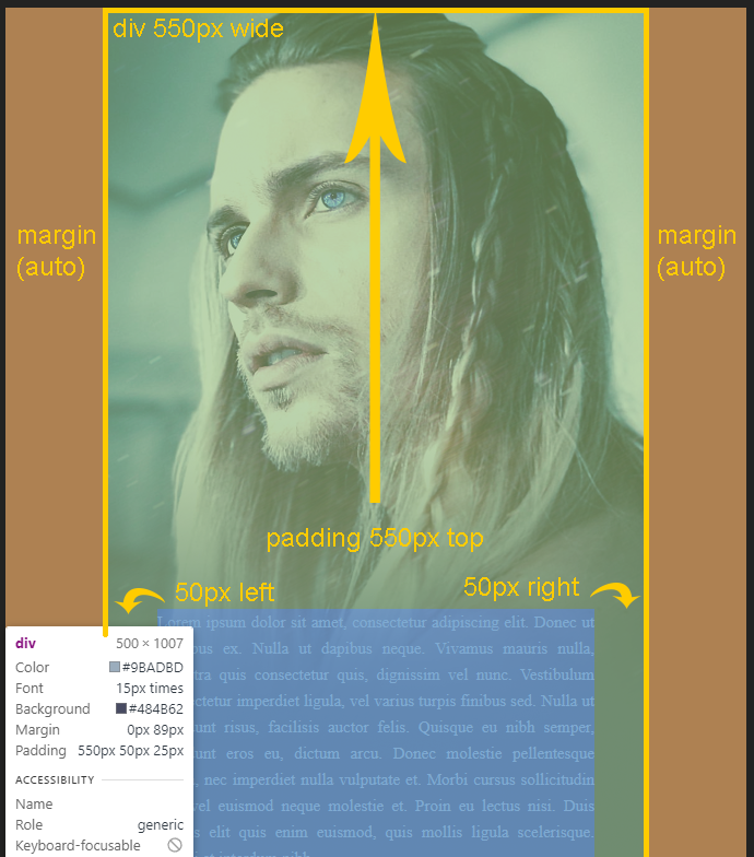
margin: I use the margin solely to center the div in the middle of the posting space. 0 means 0 margin top/bottom and auto means it centers left/right. Margin is otherwise a way to affect the distance of the element from another. For example, if you use margin-top: 100px; it will push the div down by a 100px. If you use margin-top: -100px; it will pull it up 100px, covering whatever's above it (unless you meddle with z-index). The shorthand for margin is top right bottom left, margin: 0 0 0 0.
width: The width of the div. I usually just go with the width of the image I'm using, but if you have borders, you might want to increase the width to account for the borders (if you're using border-box).
background: This is written in short-hand, going background-color, background-image, background-repeat, (background-attachment, which we are not using so there's no value for it), background-position. If you want the picture at the bottom instead, use "center bottom" instead of "center top". No-repeat means that it's not a repeating background, so it'll only show up once.
padding: In this case, padding becomes the sort of "indentation" of the text. It goes top right bottom left. So in this case it's offset by 550px from the top, and that's why the text starts "low". If this table had the image at the bottom instead, I would've put something like 25px 50px 550px 50px instead, so the huge chunk of blank space would've been in the bottom position instead.
text-align: Just the align of the text. I prefer justify, but left is scientifically considered easier to read. But I love justify.
font-family: Just whichever font family you wish to use. Remember to keep it readable! My go-to is times.
font-size: Again, remember to keep it readable. The industry standard for web pages is considered 16px, and I recommend not using anything below 14px. Small font sizes can be very hard to read for some people.
color: The font color. Remember to have enough contrast so that it's readable. :)
Here's a visual guide to how margin and padding works! Notice how the image is sticking out to the left? That's a negative left margin at work. ;)

I hope this posting table base will be of help for someone!
Lorem ipsum dolor sit amet, consectetur adipiscing elit. Donec ut faucibus ex. Nulla ut dapibus neque. Vivamus mauris nulla, pharetra quis consectetur quis, dignissim vel nunc. Vestibulum consectetur imperdiet ligula, vel varius turpis finibus sed. Nulla ut tincidunt risus, facilisis auctor felis. Quisque eu nibh semper, tincidunt eros eu, dictum arcu. Donec molestie pellentesque ligula, nec imperdiet nulla vulputate et. Morbi cursus sollicitudin elit, vel euismod neque molestie et. Proin eu lectus nisi. Duis iaculis elit quis enim euismod, quis mollis ligula scelerisque. Morbi et interdum nibh.
Fusce vehicula est at tellus ultrices fringilla. Nulla tincidunt ut diam nec volutpat. Quisque erat eros, dignissim nec imperdiet vel, ullamcorper nec dolor. Proin eu velit mauris. Proin auctor augue at magna vulputate malesuada. Suspendisse ac pretium ex. Vestibulum viverra nibh ut orci pretium, vel luctus massa ornare. Suspendisse dictum elit nec nibh ultrices, vel pellentesque enim iaculis.
Fusce vehicula est at tellus ultrices fringilla. Nulla tincidunt ut diam nec volutpat. Quisque erat eros, dignissim nec imperdiet vel, ullamcorper nec dolor. Proin eu velit mauris. Proin auctor augue at magna vulputate malesuada. Suspendisse ac pretium ex. Vestibulum viverra nibh ut orci pretium, vel luctus massa ornare. Suspendisse dictum elit nec nibh ultrices, vel pellentesque enim iaculis.
Code:
<div style="box-sizing: border-box; margin: 0 auto; width: 500px; background: #484b62 url('https://i.vgy.me/X2KMmR.png') no-repeat center top; padding: 550px 50px 25px 50px; text-align: justify; font-family: times; font-size: 15px; color: #9badbd;">

my post here

</div>div: a div is just a "division", a section of a piece of HTML code. Divs are flexible and actually very easy to use, and superior to <*table> tags for this purpose. Table tags are intended to be used only to display tabular data, and they cause websites to load slower, as each table needs to be rendered before it loads the next piece of data.
In this case, we only have one div. This div is the parent element, only, it has no children. If you need to add specific styling to another element (such as adding a quote), that div will become a child to the parent. If you want to add things like borders, border-radius, box-shadow, in most cases you want to add it to the parent element.
box-sizing: usually when you make a div, the width of it does not include padding and borders. This means that if you have a 500px wide div and add 25px padding on either side, you'll have a 550px wide div in reality, and it'll not look as you want it to. I use border-box because that puts the padding/border on the "inside" of the 500px, meaning my div is still 500px wide but it indents content from the sides. For borders, though, you might want to increase the base width of the div to account for them, otherwise the borders will actually cover part of the image.
margin: I use the margin solely to center the div in the middle of the posting space. 0 means 0 margin top/bottom and auto means it centers left/right. Margin is otherwise a way to affect the distance of the element from another. For example, if you use margin-top: 100px; it will push the div down by a 100px. If you use margin-top: -100px; it will pull it up 100px, covering whatever's above it (unless you meddle with z-index). The shorthand for margin is top right bottom left, margin: 0 0 0 0.
width: The width of the div. I usually just go with the width of the image I'm using, but if you have borders, you might want to increase the width to account for the borders (if you're using border-box).
background: This is written in short-hand, going background-color, background-image, background-repeat, (background-attachment, which we are not using so there's no value for it), background-position. If you want the picture at the bottom instead, use "center bottom" instead of "center top". No-repeat means that it's not a repeating background, so it'll only show up once.
padding: In this case, padding becomes the sort of "indentation" of the text. It goes top right bottom left. So in this case it's offset by 550px from the top, and that's why the text starts "low". If this table had the image at the bottom instead, I would've put something like 25px 50px 550px 50px instead, so the huge chunk of blank space would've been in the bottom position instead.
text-align: Just the align of the text. I prefer justify, but left is scientifically considered easier to read. But I love justify.
font-family: Just whichever font family you wish to use. Remember to keep it readable! My go-to is times.
font-size: Again, remember to keep it readable. The industry standard for web pages is considered 16px, and I recommend not using anything below 14px. Small font sizes can be very hard to read for some people.
color: The font color. Remember to have enough contrast so that it's readable. :)
Here's a visual guide to how margin and padding works! Notice how the image is sticking out to the left? That's a negative left margin at work. ;)

I hope this posting table base will be of help for someone!


